Case study · ClimatEnlighten × WIOF

Building a Climate Education Brand for a Future We Can Dream of

  • Brand strategy
  • Logo refresh
  • New identity
  • AI-ready brand files
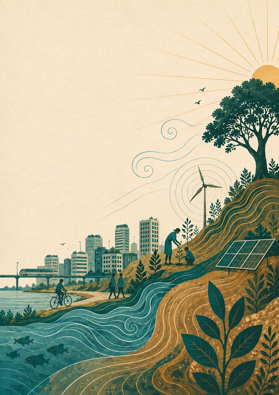
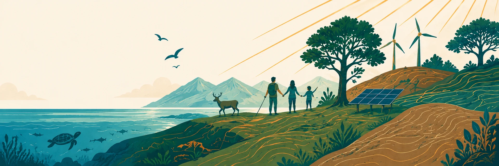
A family and wildlife on a coastline of solar panels and wind turbines, under a rising sun

The story

How WIOF became two brands

WIOF, World Is One Family, is a socio-environmental movement a handful of concerned, passionate people started six years ago, during Covid, when concern for the planet was rising everywhere. Its work was about getting people to care about the planet.

What people kept asking, once they cared, was simple: now what do I actually do?

That question is what ClimatEnlighten grew out of, a venture built to teach the how.

The brief

Left alone, WIOF and ClimatEnlighten would keep drifting further apart, until they read as two unrelated organisations instead of one family that had grown in two directions.

The brief had to do two things at once: give ClimatEnlighten a look of its own, and make sure anyone who already knew WIOF could tell, at a glance, that the two belonged together.

Before touching a single colour, I sat down with Shiv and Devraj one-to-one, to find the language underneath the brand rather than just choosing what it should look like.
The foundation

1:1 sessions with Shiv and Devraj

Each session answered one question, then became a file the next session built on. Those four files are what the brand stands on.

  1. Identity.md

  2. Audience.md

  3. Messaging.md

  4. Brand.md

Plain text with light formatting, so any AI tool, or a person, can open and read it instantly. That's why this brand's rules live in .md files, not a design file only software can open.

The 1:1 sessions were like soul-searching for us. They helped us step back, discover what we were actually trying to say and understand the brand much better. By the end, it felt like we had uncovered something that was already there.
Shivkumar Krishnamoorthy & Devraj SoniCo-founders, ClimatEnlighten

The transformation

Two marks, one family

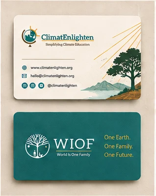
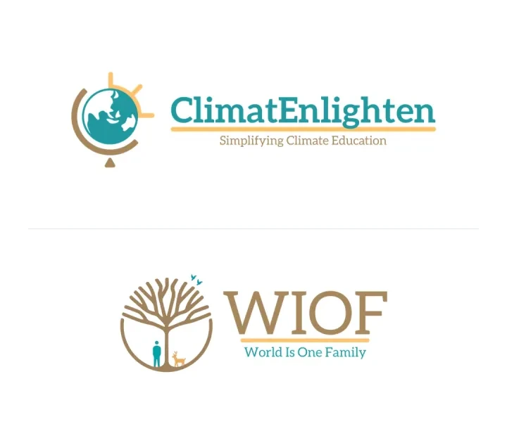
WIOF's tree stayed exactly as it was. ClimatEnlighten got a mark of its own, deliberately drawn in the same style, so the two read as one family instead of two different design languages.

ClimatEnlighten and WIOF's new logos, one above the other
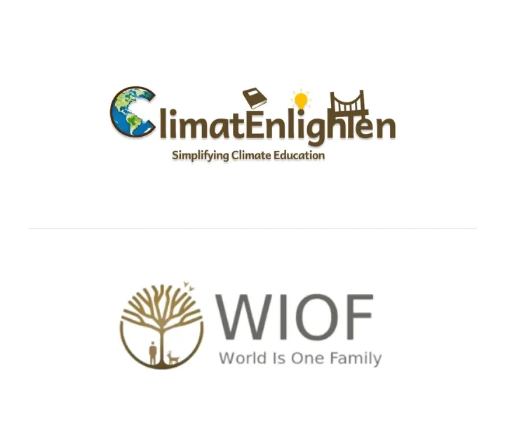
ClimatEnlighten and WIOF's original logos, one above the other
BeforeAfter

ClimatEnlighten

The old logo packed a globe, a book, a bulb and a bridge into the wordmark itself, each one standing in for a different idea about climate or education.

The task was to fold all of that into a single icon, one mark that carried the same ideas without leaning on the words next to it.

A classroom globe does two jobs at once. It reads as the planet, and its stand reads as something you'd find in a classroom.

Behind it, a rising sun's rays fall across the globe like it's being enlightened from behind. From some angles they read like a bulb too.

The globe's stand curves into a C. The rays fan out like an E. Together they read as CE, so the icon carries the brand's initials even without the wordmark.

WIOF

The same tree WIOF has carried for six years, untouched. Six years of people recognising it wasn't worth trading away for a new design.

Only the colour changed: the brown gradient flattened into solid colour, and Ocean Teal and Sunny Marigold joined it, both borrowed from ClimatEnlighten's new palette.

The wordmark reset in Aleo, ClimatEnlighten's own typeface, and now narrows evenly on both sides, so “WIOF” sits over “World Is One Family” far more harmoniously than the old grey type ever did.

ClimatEnlighten's mark on its ownWIOF's mark on its own
We always had a very vivid picture of the world we wanted to create, but many times our slides and presentations weren't able to do justice to it. This brings that vision to life in a way we couldn't before.
Shiv

Colour and type

Every colour has one job

The palette had to feel earthy and warm, without turning every climate visual green.

Blue reads as trust and water. Green reads as growth and nature. The brand needed both, but couldn’t carry too many colours. Teal sits between them, doing both jobs without becoming just another generic-green climate logo.

Blue reads as trust and water. Green reads as growth and nature. The brand needed both, but couldn’t carry too many colours. Teal sits between them, doing both jobs without becoming just another generic-green climate logo.

Pulled straight from WIOF’s original logo and kept as-is, so the two brands share a visible root instead of starting from a blank palette.

Warmth in small doses, like the rays and the one main button.

Room to breathe, warmer than plain white.

Body text, softer than flat black.

Two typefaces

For headlines and both wordmarks. A serif gives it an education feel, but rounded terminals keep it youthful, not heavy.

Both are free on Google Fonts and already in Canva, so the team could use them from day one.

We didn't want to just show people a sustainable world. We wanted them to be able to dream about it. The brand feels a little dreamy, and that's important — because if you want people to build a better future, you first have to give them something they can imagine.
Shiv & Devraj

Built for AI

Every piece builds on the last

The team makes slides, posts and web pages with AI, one piece at a time. Each one either builds on the brand or drifts from it.

The four files keep every piece consistent with the last, so the brand compounds instead of thinning out with each new thing they make.

The five elements

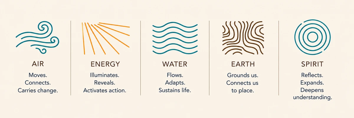
The five elements: air, energy, water, earth and spirit, each with its own line language

WIOF's five elements become a visual vocabulary: wind, rays, waves, terrain lines and circles, worked into the illustrations below.

  1. Identity.md
  2. Audience.md
  3. Messaging.md
  4. Brand.md

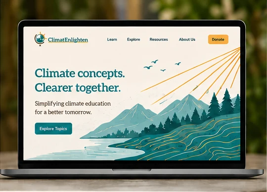
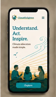
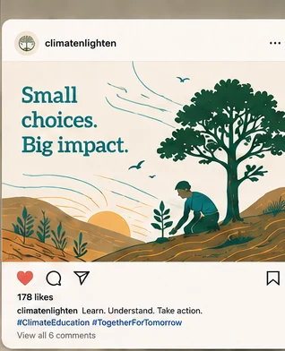
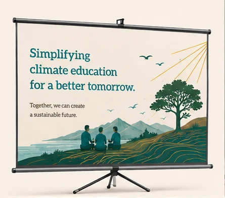
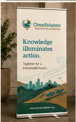
Concepts made with the brand files.

Everybody is criticising AI because you can immediately tell when something is AI-generated. We didn't want that. We wanted something that felt uniquely us. Even though AI was part of the process, the final brand doesn't feel like AI.
Devraj

What changed

The team runs the brand now

  • Course material, slides and lesson plans can be designed in-house, on-brand from the first draft.
  • The same files carry straight onto the WIOF website, no new design calls needed there either.
  • Every social post, deck or print piece that comes after can go out looking like it belongs, without a designer checking each one.
What I like is that we don't have to ask someone how every new piece should look. We have the visual language now. We just need to see whether what we're creating is aligned with the vision we've already established.
Shiv
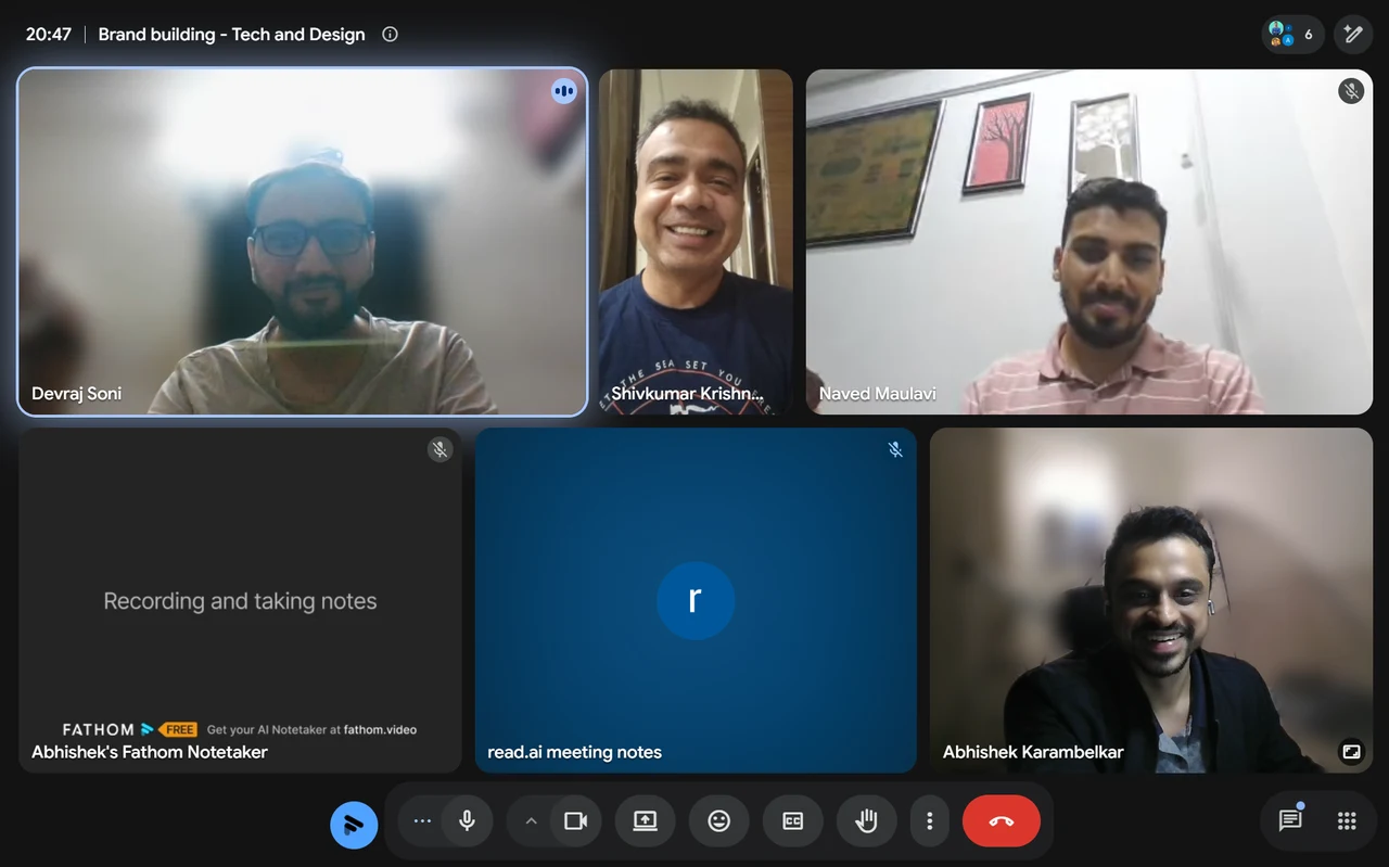
A video call with Shivkumar Krishnamoorthy, Devraj Soni, Naved Maulavi and Abhishek Karambelkar

Working through the brand with Shiv, Devraj and Naved, WIOF and ClimatEnlighten's tech lead, on how it would carry across the website, slides and everything else.

Green organisations need to be found, then remembered

Strong brand fundamentals are what took EcoFlyp 12x in 9 months. BrandFlyp builds those same fundamentals for other organisations.

Where would you like to start?

Build it together

1:1 Brand-building

From brand audits to full identity systems, work with me directly to build a brand like the one above.

See the services →

Help us make EcoFlyp greener & better

EcoFlyp is on a journey to become eco-friendlier, and we know we’re not perfect. We do not tolerate greenwashing or misleading claims. Spot an issue? Help us improve by reporting it.

By continuing past this page, you agree to our Terms of Service and Privacy Policy.